Aircraft Data Analysis
Order your Jet Analysis now!
The following part should help you get an idea of what we develop to analyse your data.
Join us in revolutionizing your aviation operations through data-driven decision-making

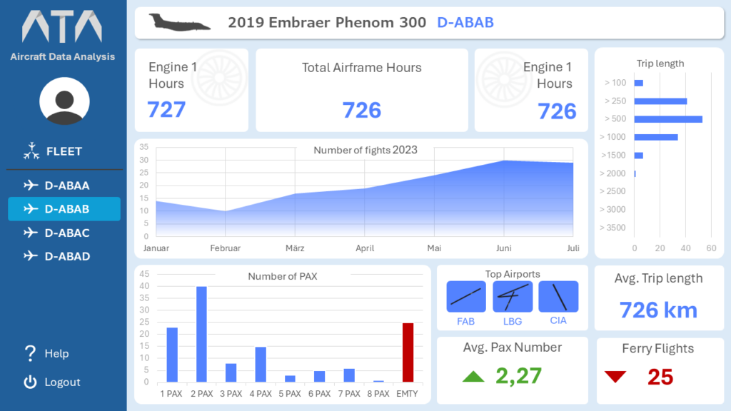
This example illustrates a comprehensive data analytics dashboard for the Embraer Phenom 300, one of the most widely sold private jets worldwide. The dashboard encapsulates data from six months of operational activity, capturing various metrics essential for business aviation analysis.
The dashboard provides visualizations such as the number of flights per month, flight durations, top destinations, and a breakdown of passenger loads during this period. For instance, it categorizes the number of passengers (PAx) per flight, allowing the business to determine whether the jet is operating at optimal capacity. By mapping the lengths of the trips, the dashboard provides insights into common routes and potential for increased efficiency.
Further analysis showcases total airborne time for the main airframe and engine hours for both Pratt & Whitney Canada PW535E engines, shedding light on engine wear and maintenance needs. These metrics are crucial for understanding the operational costs and maintenance cycles.
Moreover, the dashboard delves into the top airports used in this timeframe, providing a geographical perspective on operations. This insight is valuable for building partnerships with fixed base operators (FBOs) at frequently visited airports, which can lead to reduced operational costs and improved turnaround times.
As a next step, we analyze all flights to identify the most frequented airports in Europe. This information helps prioritize partnerships with fixed base operators and strategize on expanding networks. The analysis also aids in assessing the best regions for deploying additional jets to meet demand and reduce downtime.
We also examine the average number of passengers (PAx) on each flight to offer insights into flight utilization. This can guide charter clients to optimize passenger numbers, contributing to greater fuel efficiency and reduced operating costs. Alongside this, the average trip length is calculated, offering context for fuel consumption and indicating whether flights are typically short-haul or long-haul. This information is useful for optimizing fuel planning and aligning aircraft usage with demand patterns.
An important KPI included in the dashboard is the number of ferry flights, totaling 25 during this period, representing just under 19% of all flights. Ferry flights are non-revenue-generating flights, typically repositioning the aircraft between destinations. This metric points to potential revenue losses due to aircraft repositioning, highlighting opportunities for better scheduling and optimization to reduce these costly movements.
Overall, this data analytics dashboard provides a wealth of insights into the operational performance of the Embraer Phenom 300. It informs strategic decisions, maintenance planning, partnerships, and operational optimization to ensure the aircraft operates efficiently and profitably.
